Harbor Protocol.
The idea was to revamp the Harbor Protocol decentralized application (dApp) on the Comdex blockchain, which is backed by the Cosmos SDK and CosmWasm smart contracts. This upgraded version would allow users, secure listing of assets that can be locked in Vaults, resulting in the creation of $CMST tokens.
MY ROLE
TIMELINE
March-April, 2023
TEAM
01 Designer, 01 Product Manager and
03+ Engineer
To comply with my non-disclosure agreement, I have omitted and obfuscated confidential information in this project. All information in this project is my own and does not necessarily reflect the views of Harbor Protocol.
Objective.
In December 2022, after the release of Harbor Protocol V1 received negative feedback from users due to poor user experience.
As a result, the decision was made to revamp the entire platform, including its primary feature "Mint," In addition to other pages like Auction, Earn, Emission Voting etc.
User Insights.
Things to do:
• Prepare questions to understand your users’ problems.
• Interview users 1v1.
• Take notes.
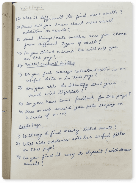
Questions to ask users - Mint, My Positions & Asset Page
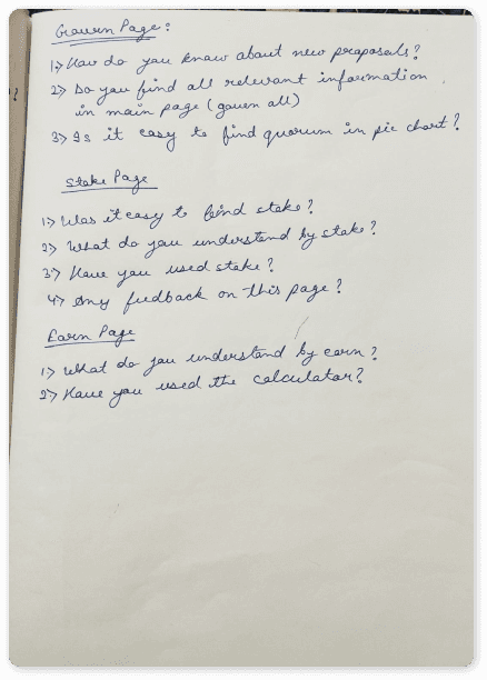
Questions to ask users - Stable Mint, Mint & Auction page
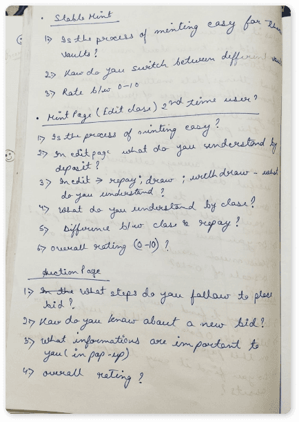
Questions to ask users -Govern, Stake & Earn page
User Interview.
I had informal conversations with a total of five individuals, both virtually and in-person, for roughly 30 minutes each. During these discussions, I took detailed notes, discerning the specific actions users take when performing various tasks and documenting any challenges encountered, along with their recommendations.
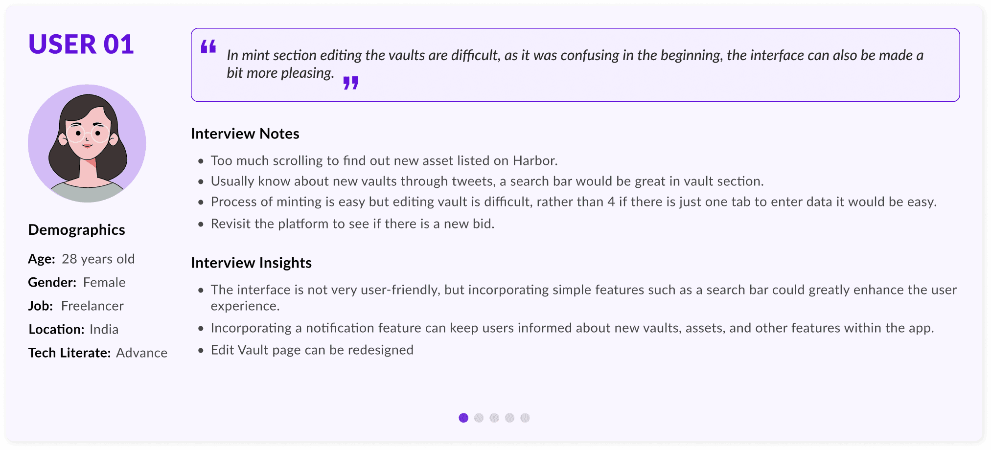
Defining Problem.
During this stage, problem statements are created by analysing the findings from user interviews. I have listed down some of the important problems faced by user.
01
Why is the Problem Important
Due to daily fluctuations in token prices that impact the CR ratio of vaults, it's challenging for users to determine when their vaults will liquidate, resulting in a 15% penalty.
The Edit Vault feature can be confusing due to the abundance of multiple options for deposit, withdraw, draw and repay.
02
Why is the Problem Important
Upon opening the vault, users have several options, including depositing collateral, withdrawing, drawing CMST, or repaying the loan. The current design makes it difficult for users to carry out these tasks.
The bidding feature displays excessive and irrelevant information, making it challenging for users to comprehend the details of the bid.
03
Why is the Problem Important
Auction is a vital protocol feature that users utilize daily, but the abundance of data presented during its operation can make it challenging for users to place bid. Additionally, it's challenging for users to obtain information regarding a new auction.
Unpacking User Needs & Ideation.
After listing down all the problems, we generate various ideas using the "Crazy 8" technique, where we brainstorm for 8 different ideas in 8 minutes (though I could only come up with a maximum of 5-6 ideas). Finally, the top three ideas are selected for each problem. We also did a few rough sketches for better visualization. In this section I am ideating for Problem 2.
Idea: Improving the Edit Vault feature
Idea 1:
We can merge two options, namely "Deposit/Withdraw" and "Draw/Repay," as both require different inputs - collateral asset for the former and CMST value for the latter.
Idea 2:
Instead of having a separate section for Edit Vault, we could merge the Deposit/Withdraw, Repay, and Draw options into a single pop-up while keeping the Vault data intact in the last page.
Idea 3:
Instead of displaying all the data in the pop-ups, we can show the Collateral and CMST values that the user will receive based on their action.
Idea 4:
We can combine the Edit options (Deposit, Withdraw, Draw, and Repay) with the Close Vault option in a pop-up window, where users can choose their desired action from a drop-down menu, and the text field and data will adjust accordingly.
Idea 5:
We can divide the Main Mint page into three sections: the first section for opening a vault, the second section for editing it, and the third section for closing it, all on the same page.
Idea 6:
In mint page we can have 3 steps for opening a vault:
1. Input collateral
2. Set collateral
3. Mint CMST We can also have three calls-to-action (CTAs) for editing and closing the vault.
Top 3 Ideas 💡
Idea:
Clubbing Deposit/Withdraw, Repay, and Draw options into a single pop-up
Idea Description:
Instead of having a separate section for Edit Vault, we could merge the Deposit/Withdraw, Repay, and Draw options into a single pop-up while keeping the Vault data intact in the last page.
Reason to Prioritize this Idea over Others:
In the current design of the Mint and Edit pages, the data is repeated. The Deposit and Withdraw options require input in collateral assets, while Repay and Draw require input in CMST value. To streamline this, we can combine these options and have only two input boxes instead of four.
Idea:
Selection of Deposit, Withdraw, Repay, Draw and Close from Drop-Down Menu
Idea Description:
We can combine the Edit options (Deposit, Withdraw, Draw, and Repay) with the Close Vault option in a pop-up window, where users can choose their desired action from a drop-down menu, and the text field and data will adjust accordingly.
Reason to Prioritize this Idea over Others:
To reduce loading time and improve user experience, we can merge all the actions such as Deposit, Withdraw, Repay, Draw and Close into a single pop-up. Users can select the desired action and input data into the corresponding text field. This approach can decrease network call time and enhance the efficiency of the app.
Idea:
Mint Page in 3 steps
Idea Description:
In mint page we can have 3 steps for opening a vault:
1. Input collateral
2. Set collateral
3. Mint CMST
We can also have three calls-to-action (CTAs) for editing and closing the vault.
Reason to Prioritize this Idea over Others:
We can optimize the design by reducing data redundancy across the three actions, Mint, Edit, and Close. The Mint page can be restructured into three steps, where the most relevant action is displayed at the top, followed by the required input fields. For the other two actions, we can use pop-ups for Adjust Collateral and Adjust Loan, the CR scroller will be used to change data and text filed will also be there to insert data, and another CTA for Close option(also a pop-up). This will improve loading time by minimizing network calls.
Wireframing & Prototyping.
Following the ideation, rough sketches were created for all the top ideas and these concepts were then discussed with the team before finalizing the options for high-fidelity development.
Mint Page
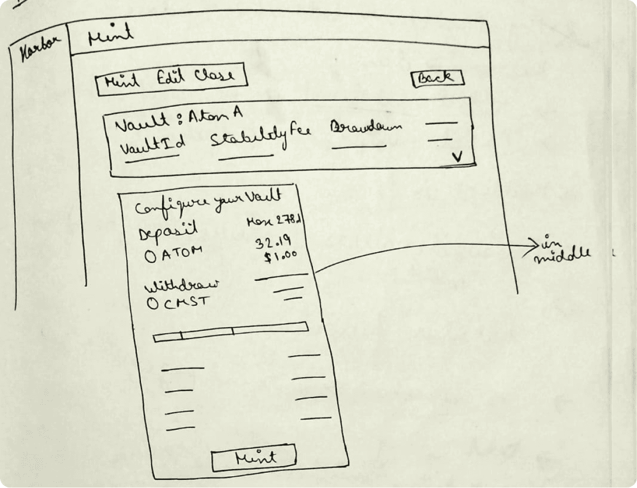
Option 1 - Data at top, Mint option in center
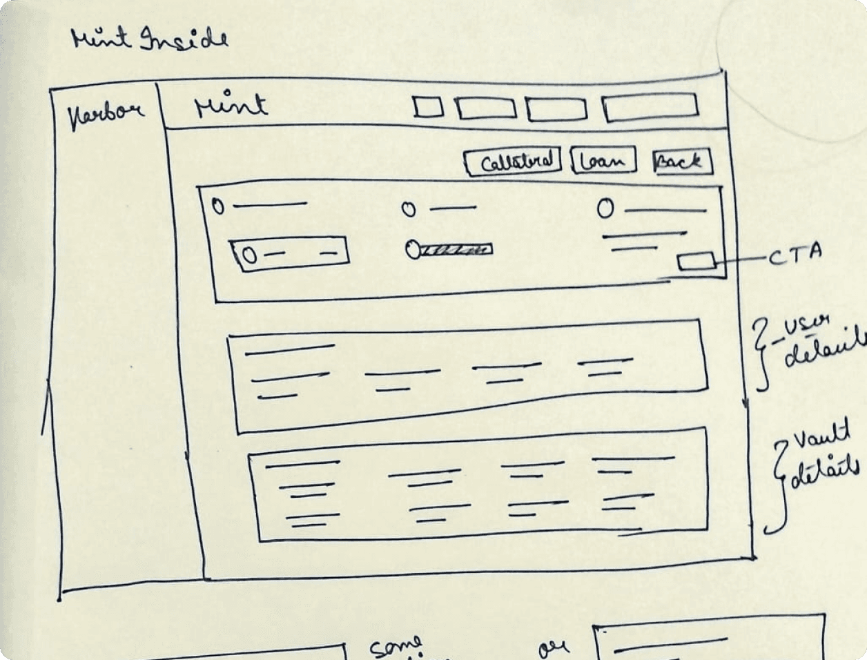
Option 2 - Mint step in top followed by Data
In the current design of the Mint page, the information is presented in a scattered manner and the user action is not very clear. However, to make the process more intuitive and user-friendly, the steps have been simplified and divided into three clear steps: first, input the collateral amount; second, set the collateral ratio; and third, review all the data and then mint the CMST.
The first option displays the data at the top with the minting option in the middle, while the second option shows the minting step at the top, followed by user data and vault data.
Edit Page
The current design for the Edit option can be confusing for users with four separate text fields for Deposit, Withdraw, Repay, and Draw actions. To make it easier for users, the idea is to eliminate the text boxes and minimize the user actions required.
In the first option, a dropdown menu will be used so that the text field will only take input for the selected action, and the displayed data will be relevant to that particular action.
In the second option, the Deposit and Withdraw actions will be combined, and users will be able to set values by moving a scroll bar. For the Draw and Repay actions, a separate pop-up will be used, and there will be a single pop-up for the Close action.
In the third option, two actions will also be combined, and users will be able to set values by using plus and minus icons instead of a scroll bar.
Edit Page
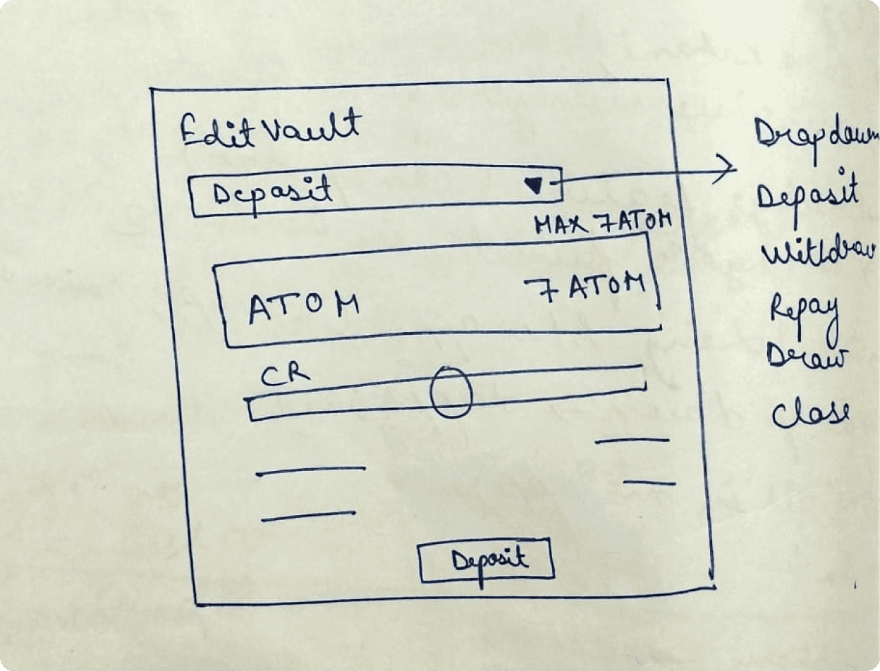
Option 1 -Edit option, dropdown for all action
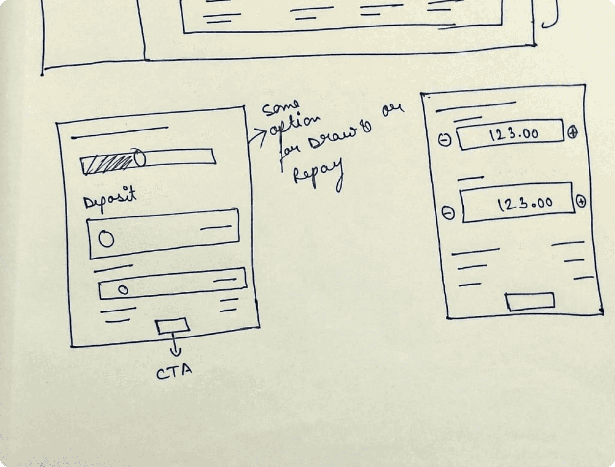
Option 2 - Edit option
High-fi design.
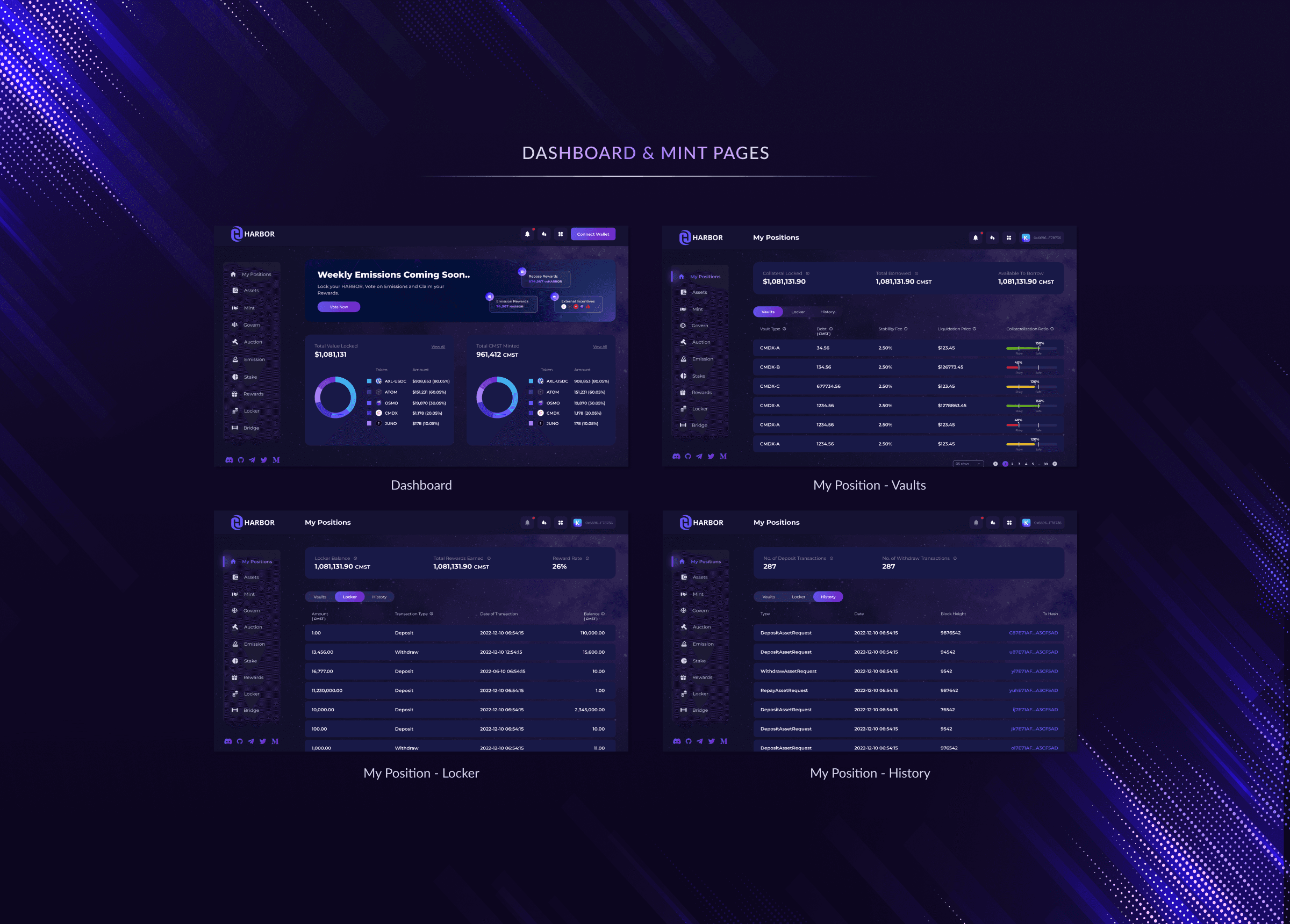
Once the Low-fidelity design was reviewed and approved by the core team, the High-fidelity design was created for all screens with a revised visual design.
The visual design was developed through multiple iterations, starting from mood boards and style tiles, then moving on to the UI kit, and finally creating the initial version of the style guide.
Visual Design.
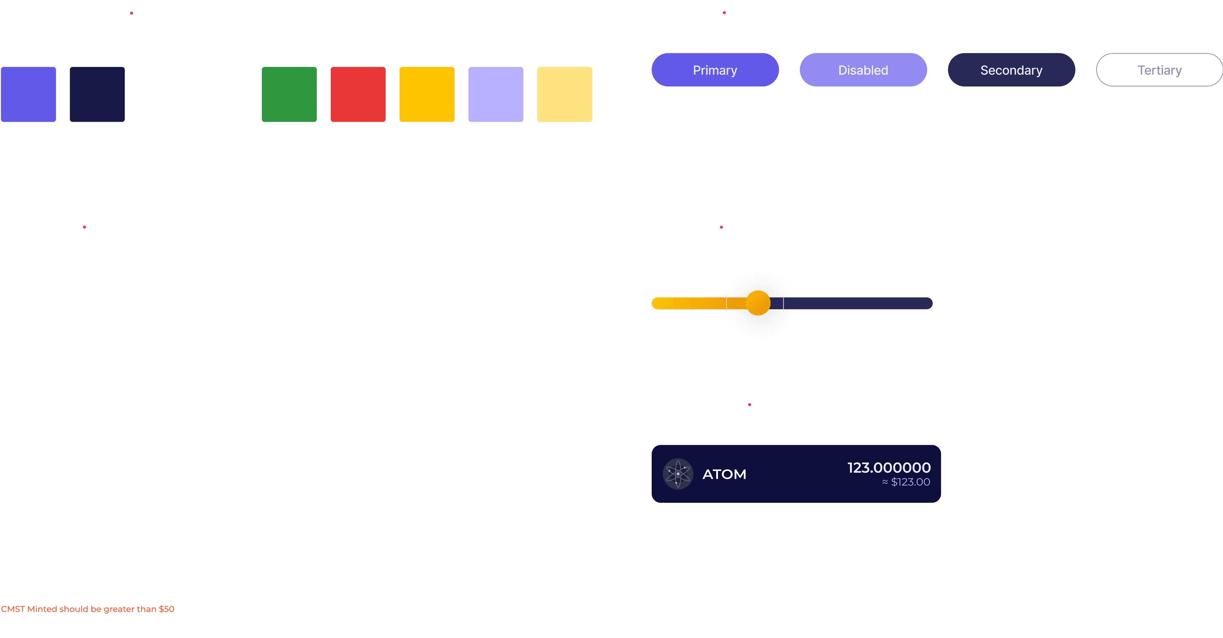
I made sure the design tells a clear story by creating a style guide and improving the user interface to keep visual and interaction consistency.
Testing.
It becomes crucial to test the prototype we have built and gather feedback on it. Testing helps us to determine if our solution actually works and if it addresses the problem effectively. It is not enough to simply come up with a solution; it needs to be functional and practical. Therefore, user testing is necessary to ensure the success of the prototype.
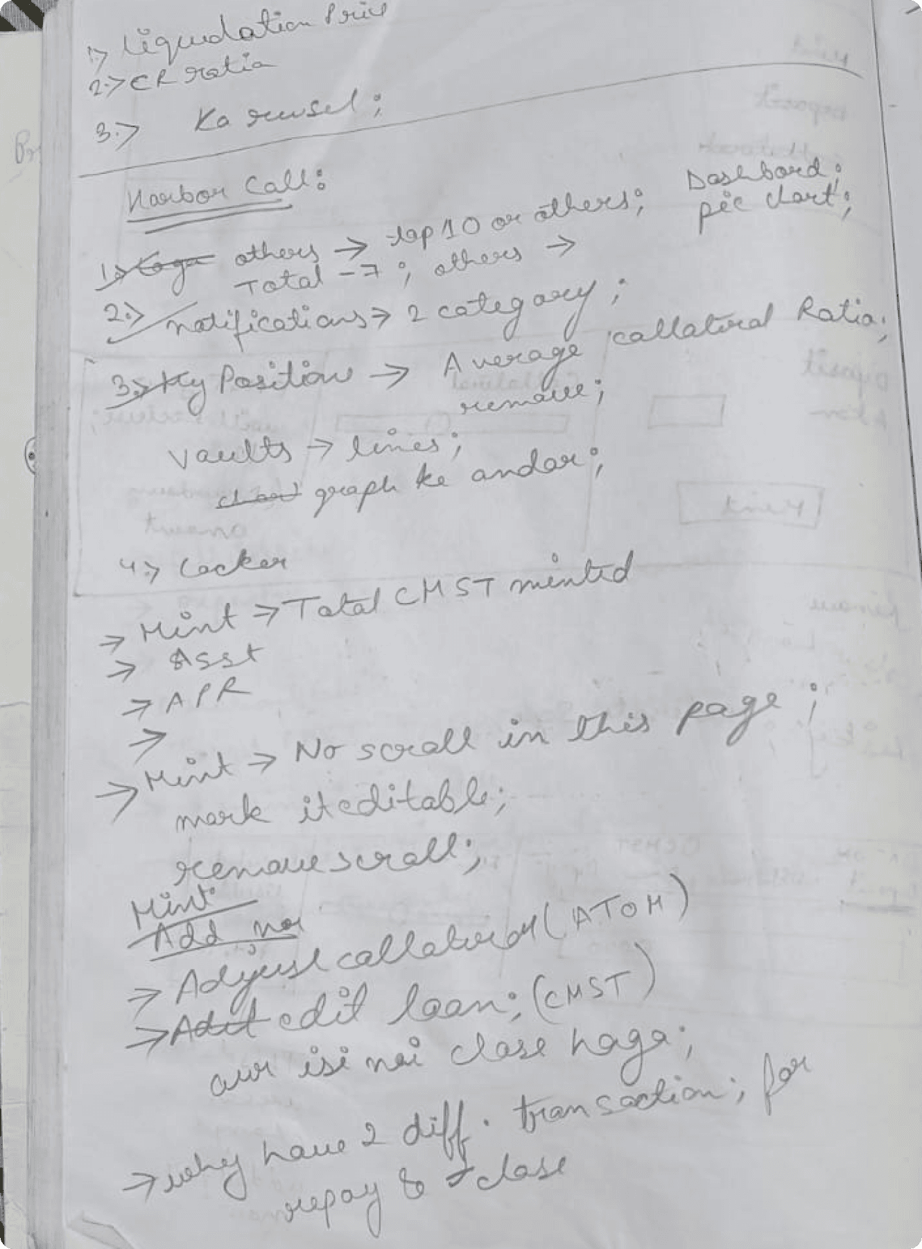
Feedback received during call with the team/users

Feedback received during call with the team/users
Following the testing call, the platform was updated with the necessary changes and the process was repeated until the entire team was aligned with the changes.
Learning.
Journey Maps is a Valuable tool.
Journey mapping becomes increasingly valuable as the process becomes more complex. It not only allows for a comprehensive representation of the process and identification of both problematic and promising areas, but also provides a solid foundation for collaboration among all stakeholders involved.
01
Choose Interview questions Unfavourably
Each time I drafted questions for user or team interviews, I tended to be biased towards the solution I wanted to offer, rather than remaining impartial towards the product.
02
Failure is okay
I faced numerous challenges in comprehending the product's process and concept, and it took me days to come up with ideas for certain pages to simplify the steps. Despite my efforts, I still encountered roadblocks. However, I sought the assistance of my team members and explained my problem, which yielded valuable insights.
03
Up Next.
Comdex Website

© 2024 Portfolio by Prerna Prasad. Made with Love.


